Serif
1 |
serif |
serif; häkchen |
|
2 |
|||
3 |
|||
4 |
|||
5 |
General
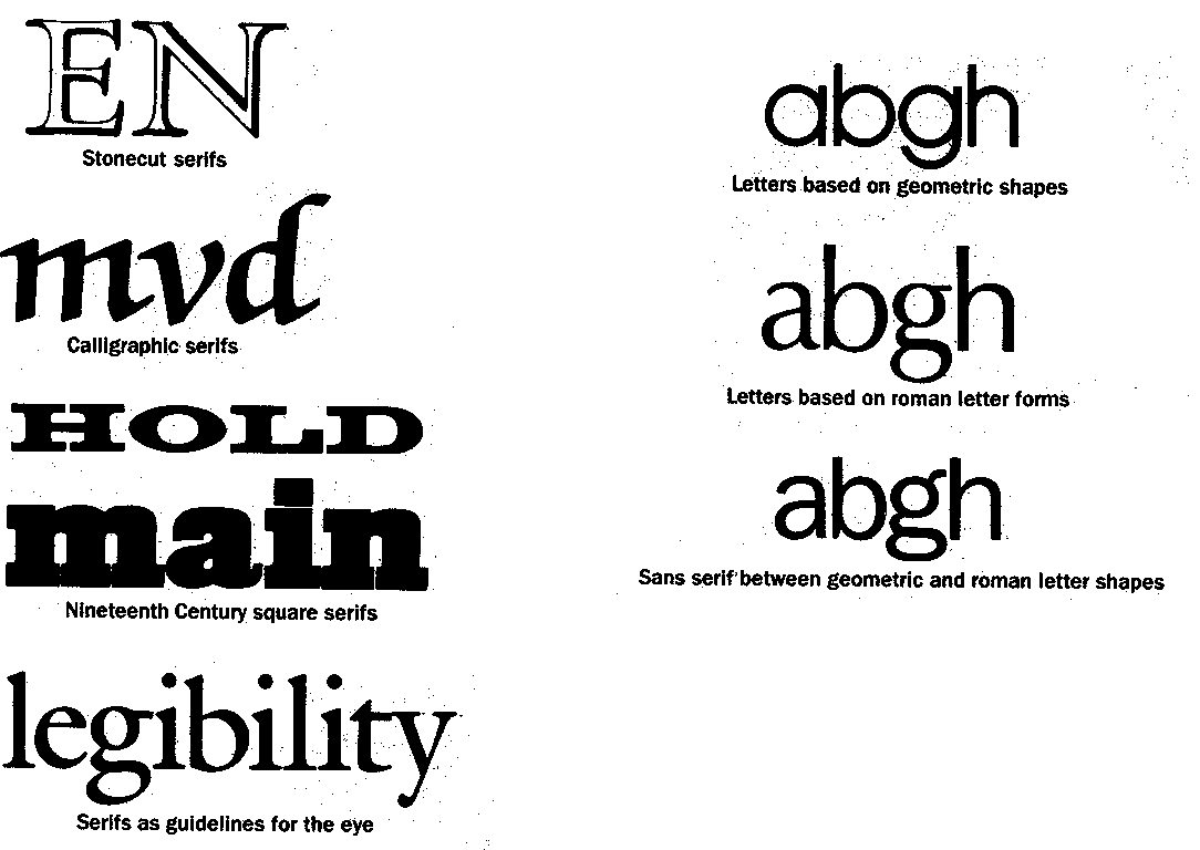
Serifs are the short more or less horizontal extensions at the end of strokes or in corners of the shape. Serifs found their way into typography in the late 15th century, most likely by Nicolas Jenson. Although there are several theories, no one is exactly sure how the serif originated. Some feel that serifs were a natural outgrowht of calligraphy. Others contend that serif were a deliberate and contrived addition put on letters by the ancient Roman stonecutters. The serifs were invented to give the stonecutters an established baseline a litte "cheating room" at the dges of each character stroke.
The caligrapher theory believes that the stonecutters first drew their letters with a brish before cutting them in the stone. The calligraphic strokes woul leave serif-like terminals which were incorporated into the final work.
It is claimed that carefully designed serifs guide the eye of the reader in the reading direction. Serifs alos make the characters use additional room. This avoids too tight connections especially for character sequences of ll, il, mm, nn etc.
Style of serifs
The style of serifs characterises the overall shape of glyphs. Their influence on the appearance of a glyph is very strong. The shape of the glyphs, however fits the design of good type. Slab serifs may not fit to a glyph design of high contrast strokes (such as the M in the first place of the figure below).
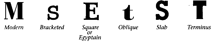
| 1 | Modern |
dünne serifen |
|
| 2 | Bracketed | gebogene serifen | |
| 3 | Square | eckige serifen | |
| 4 | Oblique | schräge, abgeschrägte serifen | |
| 5 | Slab | klotzige serifen | |
| 6 | Terminus | auslaufende serifen |
Sans serif
Glyph designs without serifs are called sans serif or antiqua. ...
![[To top/bottom of page]](../../z_designs/nav-dnup.gif) Sources
Sources
...
Further links