Glyph
General
When we speak about characters we assume two things: the image that we see and the symbolic information that relates to this image. The specific form (shape) of a character is called a glyph: Same character with different glyphs:
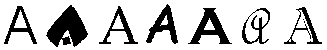
A glyph is the minimal unit of font information. Each glyph can be defined in two ways: information about the character the glyph represents and specific information about the glyph. For example, we can define the character “H” as “two vertical strokes with one horizontal stroke that connects them at half their height.” All possible shapes of the character H can be defined this way. To get a glyph definition, we would add the following words (for the Times typeface): “The vertical strokes are wider than the horizontal strokes and each of them is finished by thin rounded serifs.”
Meaning of glyphs
The same image may have many meanings. For example the character “H” means one letter in the English language and a very different letter in the Russian language (very close to an English “N”) or in the Greek language (Eta).
Features of glyphs
Although the Chinese have invented moving letters long before Gutenberg not
much is known about form variations for non-latin scripts. For latin scripts
(and derivatives such as cyrillic) letterforms got many features. The names
of the different parts of a character have a long and well documented history.
There are manuscripts going back to the 15th century. The most used terms
are listed in the image and table hereafter.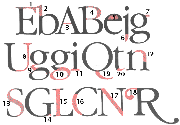
| Description of feature | ||||
|---|---|---|---|---|
1 |
horizontal stroke that is free on one end | Arm |
Arm |
|
2 |
part of the lowercase letters b, d, f, h, k, l and t that extends above the x-hight | Ascender | Oberlänge | |
3 |
horizontal stroke in the letters A, H, e, t and similar letters | Bar | ||
4 |
curved stroke which makes an enclosed space with a character | Bowl | ||
5 |
fully or partially enclosed space within a character | Counter | Punze | |
6 |
part of the letters g, j, p, q, y and sometimes J, that extends below the baseline | Descender | Unterlänge | |
7 |
small stroke projecting from the top of the lowercase g | Ear | ||
8 |
a thin stroke usually common to serif typestyles | Hairline | ||
9 |
the stroke connecting the top and bottom of a lowercase g | Link | ||
10 |
lower portion of lowercase g | Loop | Schlaufe | |
11 |
a line crossing the main strokes of a character. There are many varieties | Serif | Serif | |
12 |
descender of Q or short diagonal stroke of the R | Tail | ||
13 |
the end of a stroke not terminated with a serif | Terminal | ||
14 |
curved stroke of the h, m and n | Shoulder | ||
15 |
main curved stroke of a lowercase or capital S | Spine | ||
16 |
a small projection off a main stroke; found on many capital G's | Spur | ||
17 |
straight vertical stroke, or main straight diagonal stroke in a letter which has no vertical strokes (x, X, z, Z) | Stem | Stamm | |
18 |
direction of thickening in a curved stroke | Stress | ||
19 |
straight or curved line | Stroke | ||
20 |
fancy flourisch replacing a terminal or serif | Swash | ||
21 |
relation between thin and thick strokes (pole or equatoral position in round glyphs) | Contrast |
Interpretation of glyphs
In hot-metal times the term glyph was not yet used. A letter was the physical representation of a character: a block of metal with the cut out mirrored image of the letter shape.
With the advent of electronic printing, the variety of shapes for a chacrater proliferated – because it became much easyer to create and modify shapes. The glyph is described as an outline from which various process-dependent forms can be derived. For most printing processed the outline is transformed into a bit-map ➔ rendering, rasterising.
Special glyphs
At least in the western typographic world special forms have developed:
 |
Fleuron | ||
 |
Grammalogue (Literally, a letter word; a word represented by a logogram): et, at | Logogramm | |
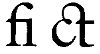 |
Ligature |
Ligatur | |
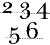 |
Oldstyle figures, medieval figures | Mediävalziffern |
![[To top/bottom of page]](../../z_designs/nav-dnup.gif) Sources
Sources
ITC publication u&lc (upper and lowercase) around 1990.
Further links